All About Built In's

In the past, built-ins/cabinets used to just be for kitchens, bathrooms, and laundry rooms. These days, we’ve gotten smarter with our storage needs. Here are some tips for designing and styling your built-ins--
Styling Tips and Tricks
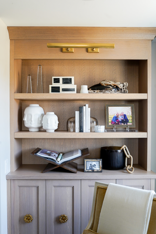
A great styling trick is to always put a piece of art or something large on the back wall of the shelf and then layer in front of it. This gives the shelf depth and is really pleasing fro the eye to read.


Collectibles are the best things to help fill up some space in the built-ins. Things like pieces of history, pictures of precious moments in time, or interesting small statues and objects are perfect. Your favorite books can also help give your built-ins some character, and give a glimpse into your interests. Considering everything you are planning on displaying on your shelves, remember that you want to leave some space to fill in over time.
For a larger or prized book, the best way to display that is on our book cradle. It comes in wood and lucite and it is beautiful. An open book is so much more interesting than just keeping them closed on the shelf. You can also display items inside of the open book such as our White Jade Calligraphy Brush.


Generally, it's best to put fewer items towards the top since they are harder to see. But pottery is a perfect larger object to display at the top of shelves. Smaller items should be at eye level–especially photos. For extra texture, we love the Crystal Orb Frame. You’ll also want to incorporate non directional items, which are things that look good at any angle. Some great options are the Marble Handkerchief Bowl and Face Vase.
Graduating height throughout the built-ins is key. This means placing like or similar items of varying size next to each other to accentuate other items nearby. There is a perfect example in the video below where Jess explains the styling of placing a Crystal Obelisk and then a Crystal Orb next to some books. It gives a very nice “up down” motion keeping the eyes moving.
Creating an Authentic Space
Something we always strive for in design is authenticity. Each item should make sense in its space. Which is why we don’t tend to use faux plants when styling shelving. If a real plant couldn’t live there, a faux plant seems very out of place. Similarly, if you like candles, actually use them! Candles are meant to make a space smell nice and they can’t do that if you’re not using them. One of our favorite candles is the Cyrnos for its scent and beautiful design.


Styling Session
Watch this video to see just how Jessica Bennett would style some built-ins!


Comments