

Shelf Styling 101: Why the Empty Space Matters as Much as the Objects
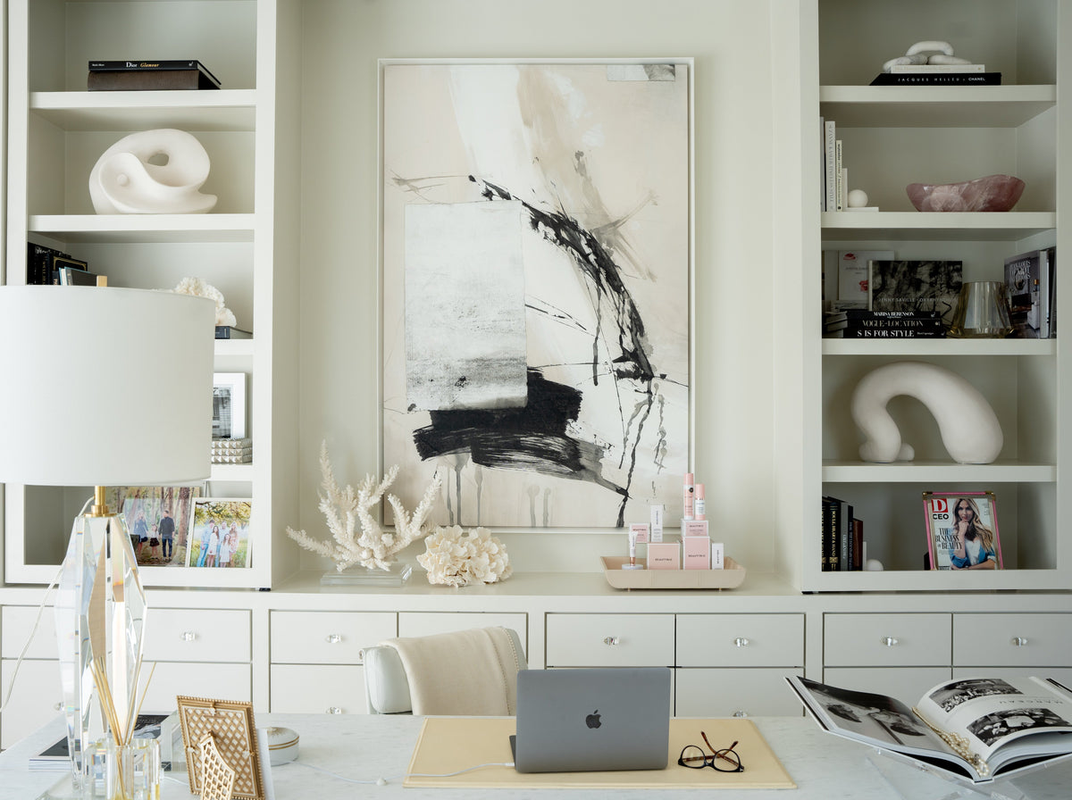
A well-styled shelf is one of those things that looks effortless and isn't. People spend an hour arranging objects, step back, and feel like something is still off, without being able to say exactly what. The arrangement looks crowded, or flat, or somehow both at once.
In our experience, the problem is almost never the objects. It's the approach. Most people style a shelf the way they pack a suitcase, filling every available inch until there's nothing left to add. A shelf that holds everything holds nothing well.
Here are the seven rules we come back to every time.
1. Edit Before You Style


Before placing a single object, take everything off the shelf. Every book, every candle, every thing that has migrated there over time. Start with a completely empty surface. Then put back only what earns its place.
This is not about being minimal for its own sake. It's about curation, the deliberate act of choosing what deserves to be seen. A shelf is not a storage solution. It is a composition. Treat it like one, and the goal becomes clear: put back roughly half of what you started with. The rest finds a drawer, another room, or the door.
2. The Triangle Principle


Once you know what you're working with, the first thing to establish is height variation. Objects on a shelf should create a visual triangle, tall at one point, medium in the middle, lower at the other end. The eye follows this rhythm naturally, moving across the shelf without getting stuck.
A shelf where everything sits at the same height reads as flat, almost like a lineup. A shelf where heights vary creates the immediate sense that someone made considered decisions about what goes where. That's the feeling you're after.
3. Think in Three Categories


Every well-styled shelf works with three categories of object, and it needs all three.
Something tall — a branch in a vessel, a lamp, a sculpture — gives the shelf its height anchor and its most visible point of the triangle. The Magnolia Branch is one of the easiest ways to introduce height organically. For a more sculptural vertical element, the Venus Sculpture earns its place on shelves that want a genuine art moment. If you want to display a small artwork or framed piece at height, the Milo Easel is the perfect solution that makes it look intentional.
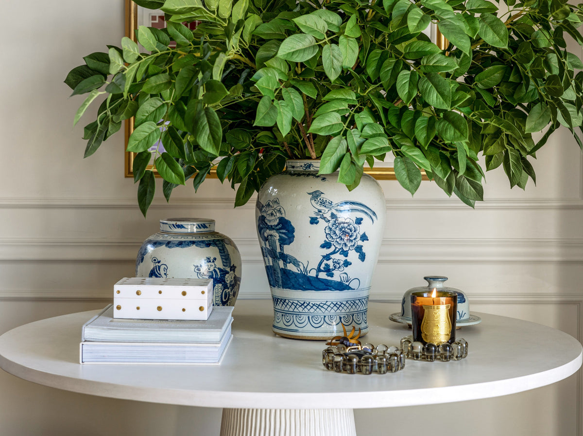
Something medium — a stack of books, a jar, a box — creates the middle ground that keeps the composition from feeling top-heavy. The Imperial Dragon Jar brings generous mid-height presence and works as the kind of object that looks right regardless of what surrounds it. The Crystal Obelisk pairs beautifully with warmer ceramic or organic objects, providing a translucent piece.
Something small — a candle dish, a marble piece, a small sculptural detail — is the finishing layer that grounds the composition and brings it to human scale. The Bubble Candle Dish introduces warmth through candlelight, which changes the quality of everything near it. The Marble Bookends in Calacatta Viola anchor a book stack with material weight that reads as considered. For a finishing detail that catches the eye without demanding attention, the Brass Angel Wing is a warm, unexpected small moment. The Princess Hand is the object guests always notice and pick up, the thing that makes a shelf feel collected rather than curated.
All three categories, on every shelf. If you're missing one, the composition will feel incomplete even if you can't immediately say why.
4. Books Are Design Elements, Not Storage


If books appear on a styled shelf, they are part of the composition. Try stacking them horizontally, in groups of two to four. A horizontal stack functions as a plinth, raising whatever sits on top of it by a few inches and creating a natural mid-height moment in the arrangement. Remove dust jackets for a quieter, more unified look; the cloth spines underneath are almost always more beautiful.
One of our favorite shelf moves: open a book in our Wooden Book Display, with a small object like the Harper Hand, propped against its spine. It reads as collected rather than arranged, like something that happened naturally.
5. Leave 30% Empty


This is the rule most people resist, and the one that makes the biggest difference. A shelf that is 70% full looks curated. A shelf that is 90% full looks like storage. The empty space is not wasted space, it is active. It creates contrast that makes the objects next to it read more clearly. When everything is packed together, nothing stands out. When objects have room to breathe, each one is seen.
6. Odd Numbers


Three objects in a grouping read better than two. Five read better than four. This is one of the oldest principles in visual composition, and it never stops being true. Even numbers create a symmetry that reads as static, balanced, yes, but resolved in a way that gives the eye nowhere to go. Odd numbers create a gentle tension, a slight asymmetry, that keeps the eye moving across the composition. If you have four objects in a grouping, add one more or remove one. The arrangement will immediately feel more alive.
7. Light the Shelf


This is the single change that elevates a shelf from styled to beautifully curated, and it's the one most people don't think to make. Light at shelf level changes the quality of everything around it. It creates warmth, depth, and the sense that the shelf was designed with intention rather than assembled from available objects. Overhead room lighting illuminates shelves from above and flattens them. A small lamp or a candle placed on the shelf illuminates from within the composition itself.
The Penny Lamp in Brass was designed for exactly this use. Small enough not to overwhelm a shelf, bright enough to cast a warm pool of light across the objects nearest to it. The Bubble Candle Dish works here too, candlelight at shelf level is one of the most immediate ways to make a room feel more considered.
The best-styled shelves look like they came together without much thought. Edit intentionally, vary the heights, keep all three categories, leave more empty space than feels comfortable, and then add light. Step back. Take a photograph. If it looks finished in the photograph, it is.
Comments